
Packaging Design
Seed Pops Redesign
project overview
Engaging, delightful and pick-up-able. The goals of this redesign on the internal side were to improve the product line both in efficiency and economically while updating design to better reflect the modern, bright and bold direction the brand had taken.
services provided
Structural Design
Packaging Design
Sustainable Solutions
Custom Illustrations
Assembly Strategy
Improved Quality Control
inspiration
Candy packaging design
Bold color blocking
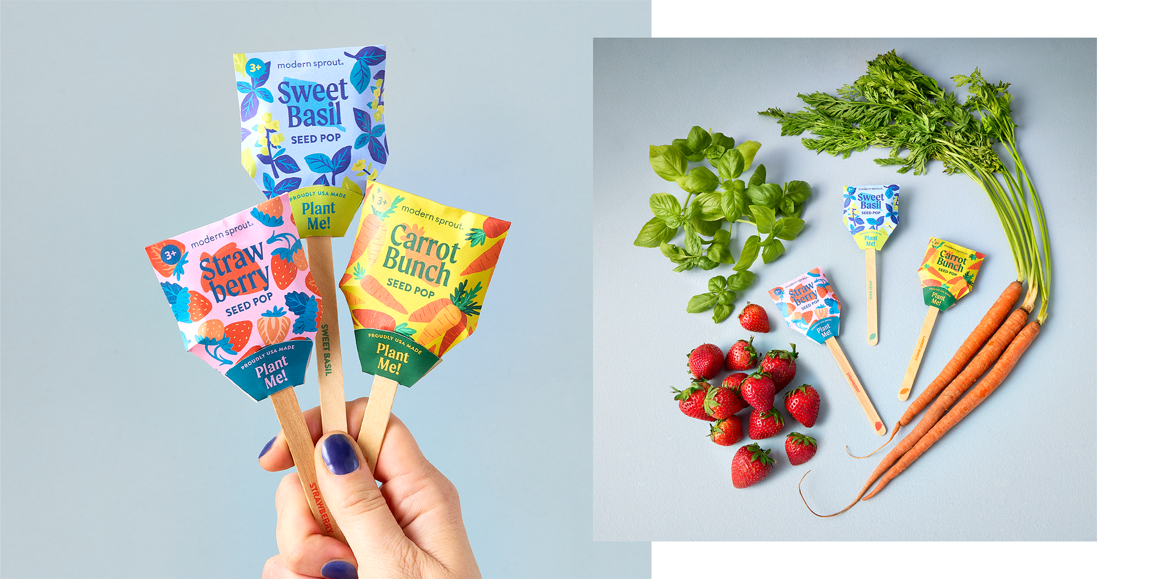
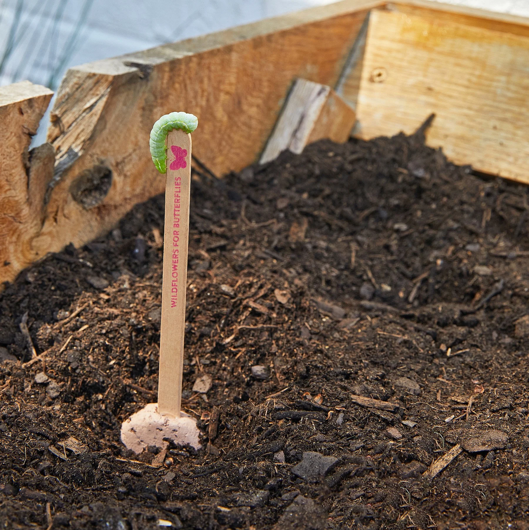
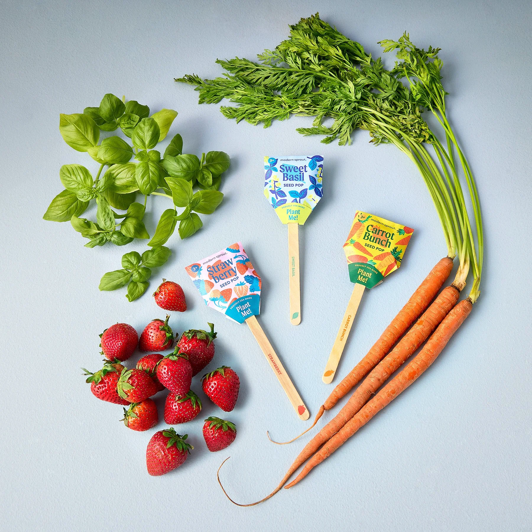
a playful take on gardening


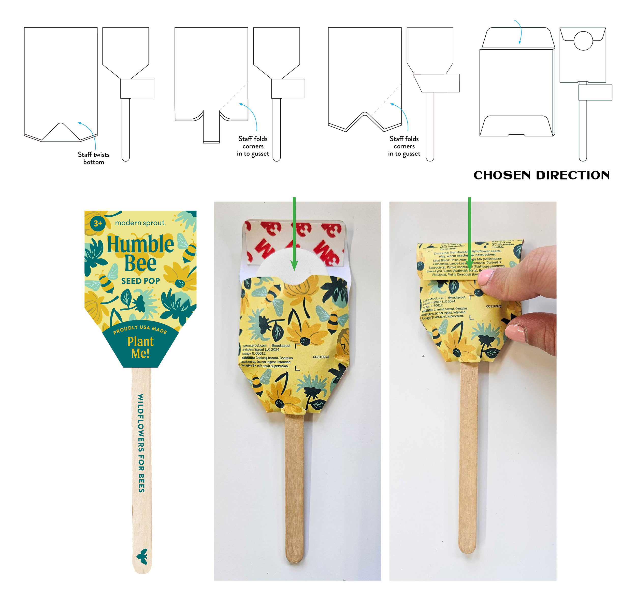
structural development
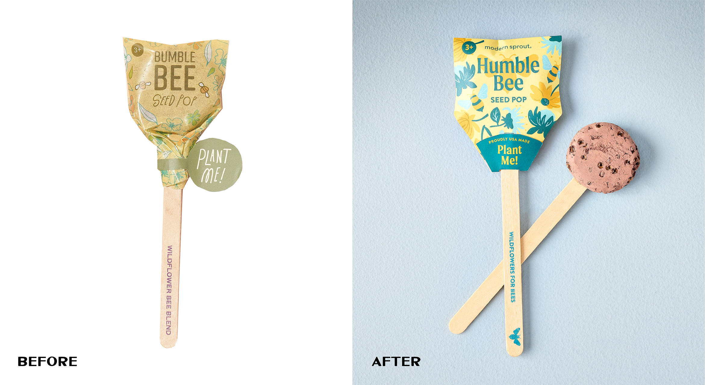
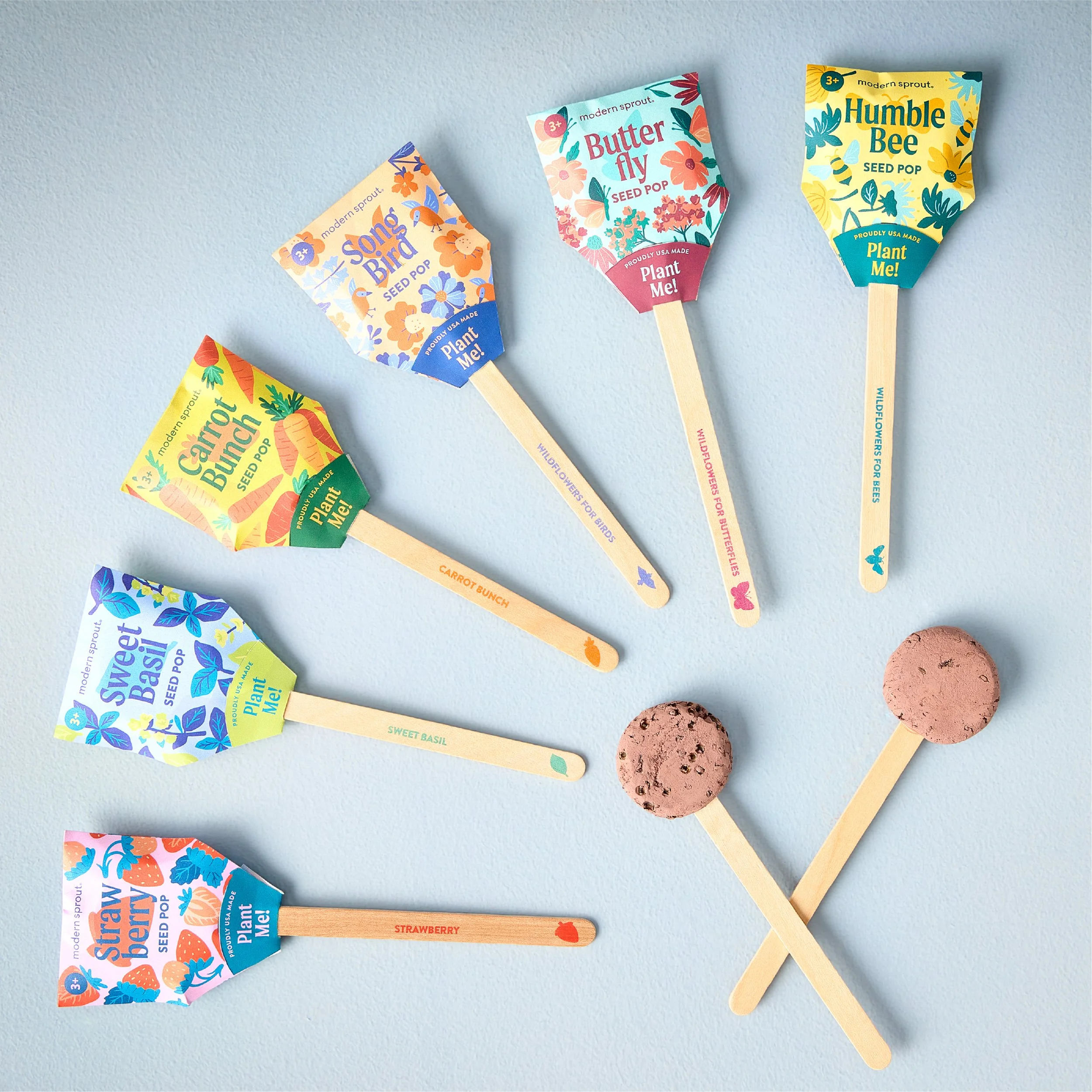
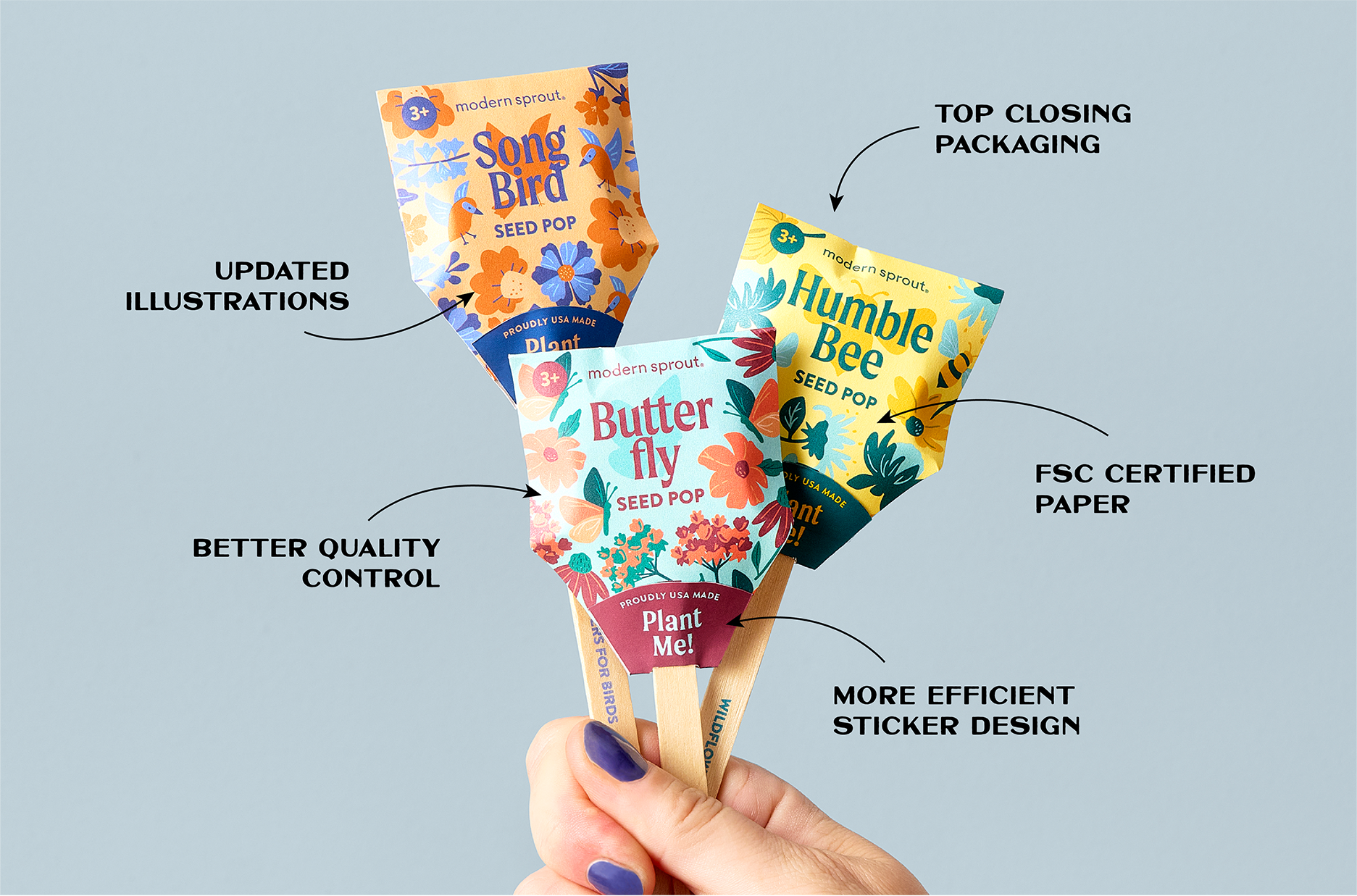
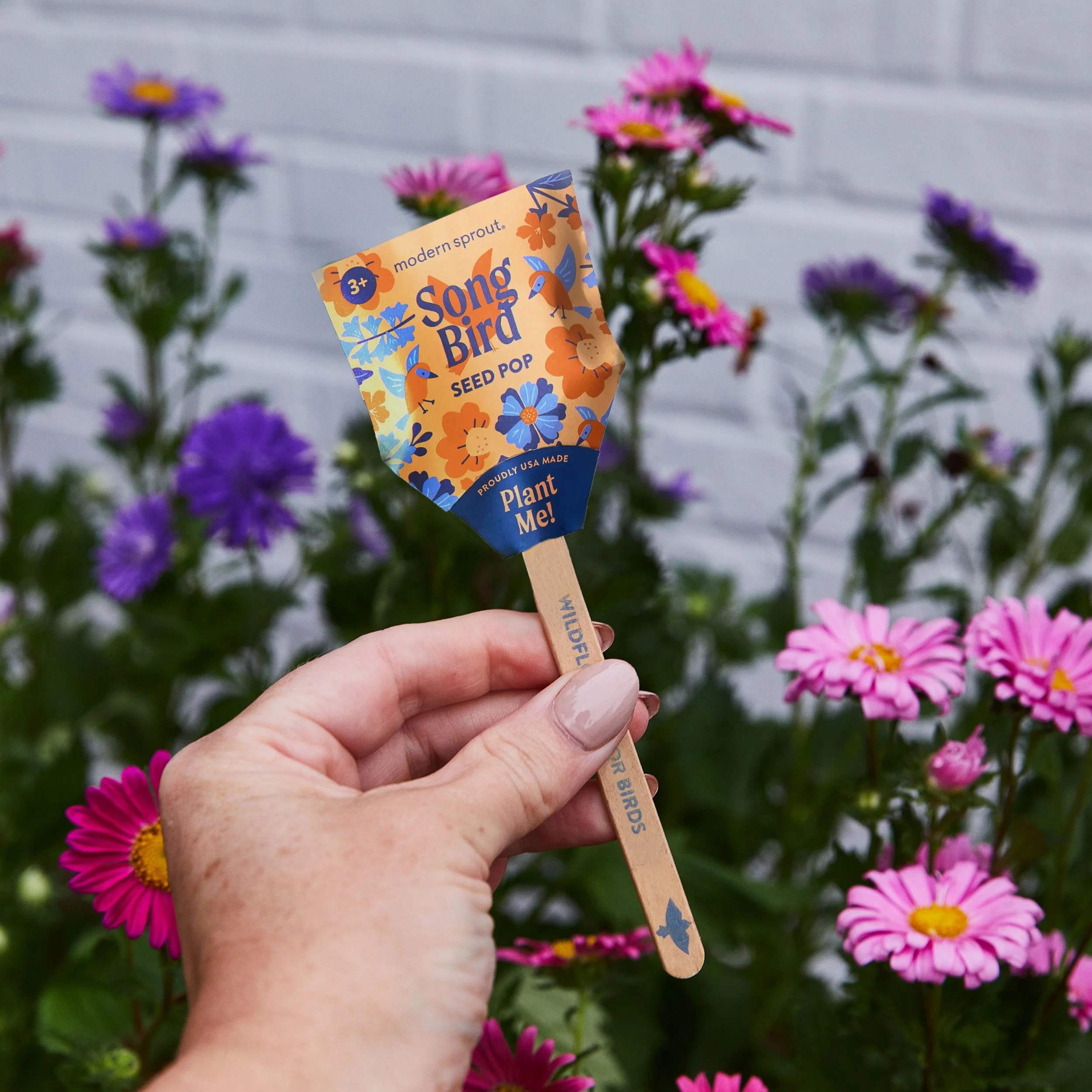
A crucial problem to solve for this redesign was the structure of the packaging. The previous design was a glassine bag that slid onto the product and twisted. However, this resulted in large variances and quality control issues; each of the hand-applied bags would be twisted to different tightnesses based on the person assembling the product.
The chosen solution was a paper envelope style packaging that slid over the Seed Pop stick and had a self-adhesive top closure. This more structured approach eliminated visual variance on shelf and increase efficiency during assembly.
Product images belong to Modern Sprout and all rights of images are reserved to Modern Sprout